The project
POW! KAPOW! BOOM! PEWPEW! SWOOSH! RATATAT!
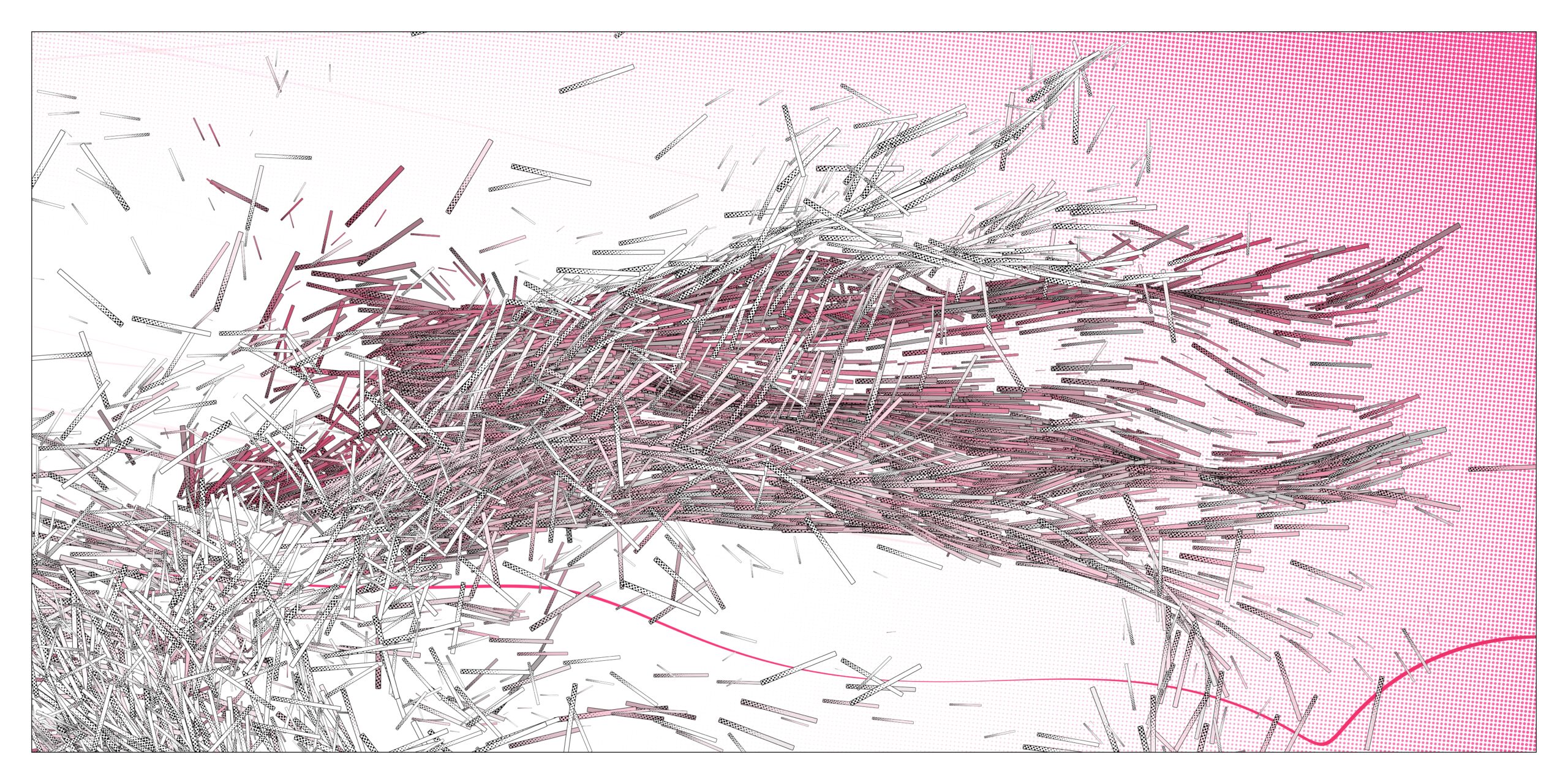
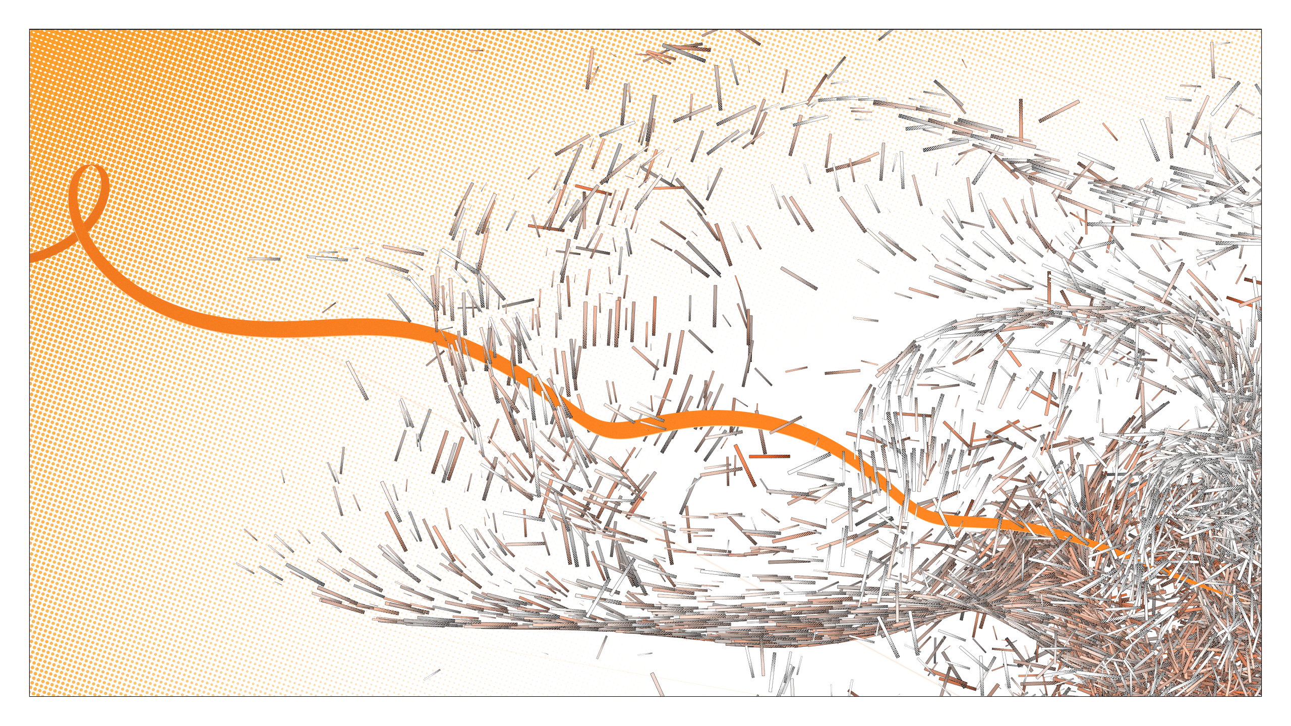
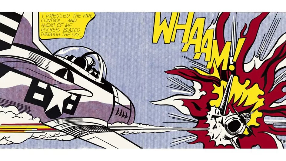
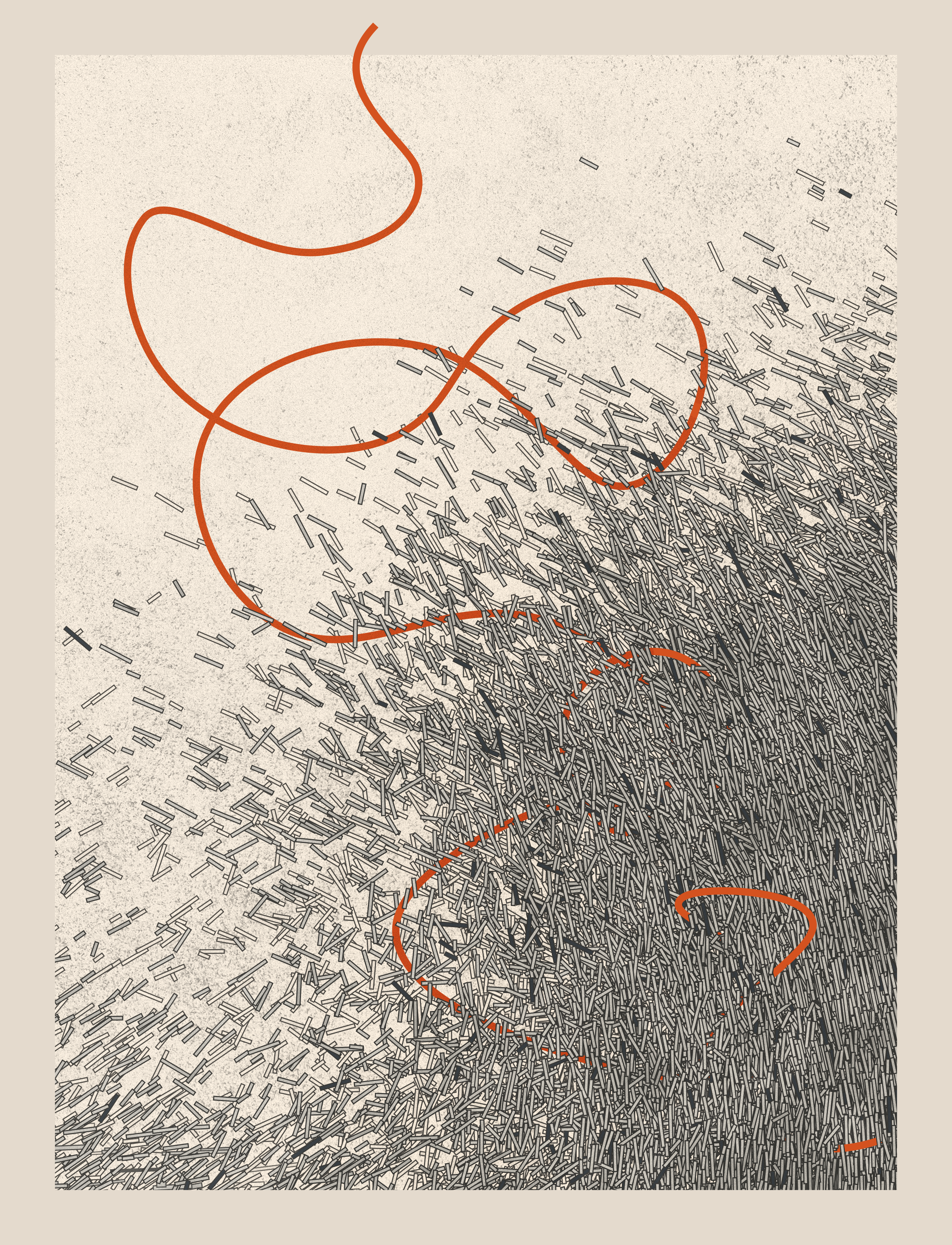
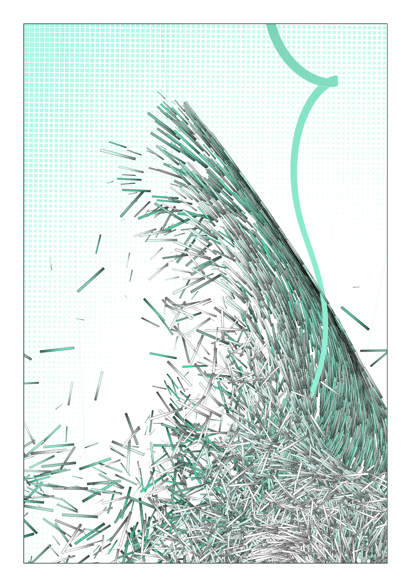
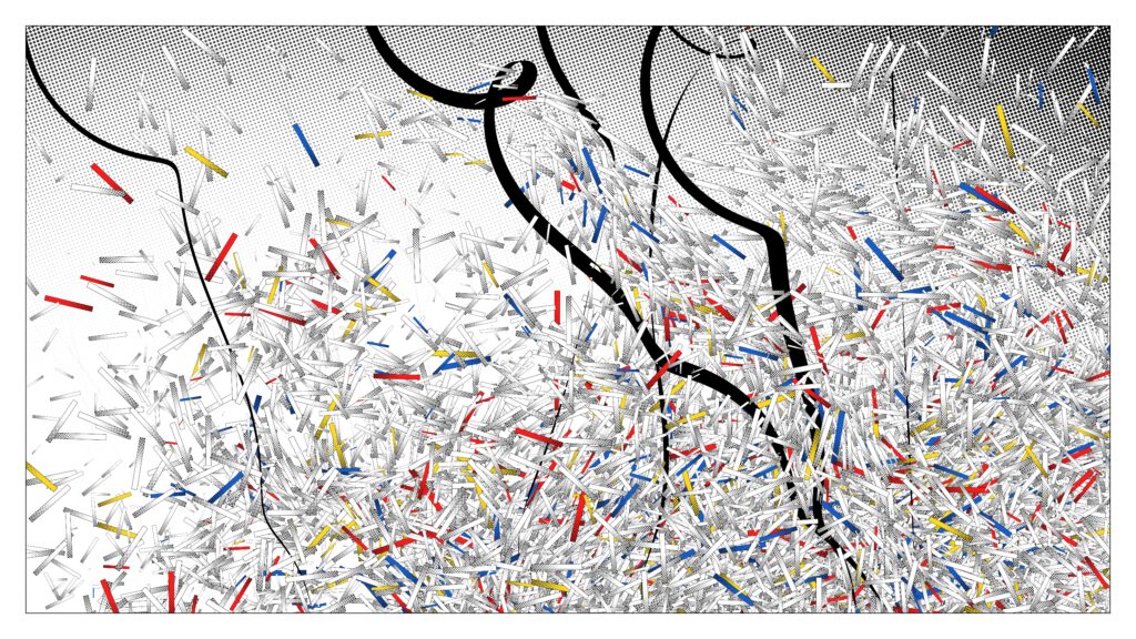
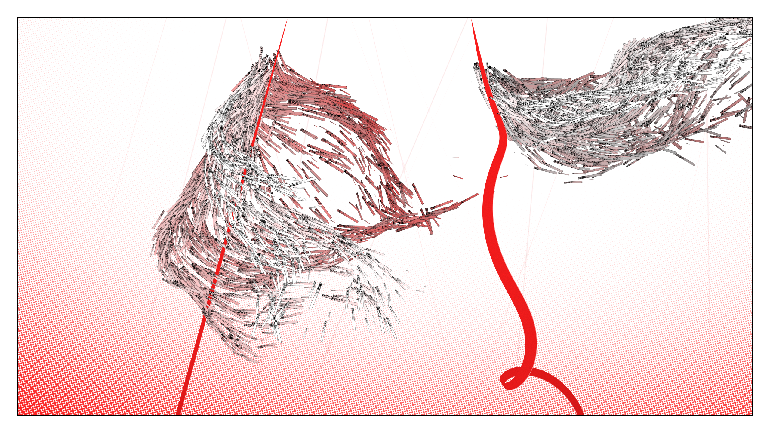
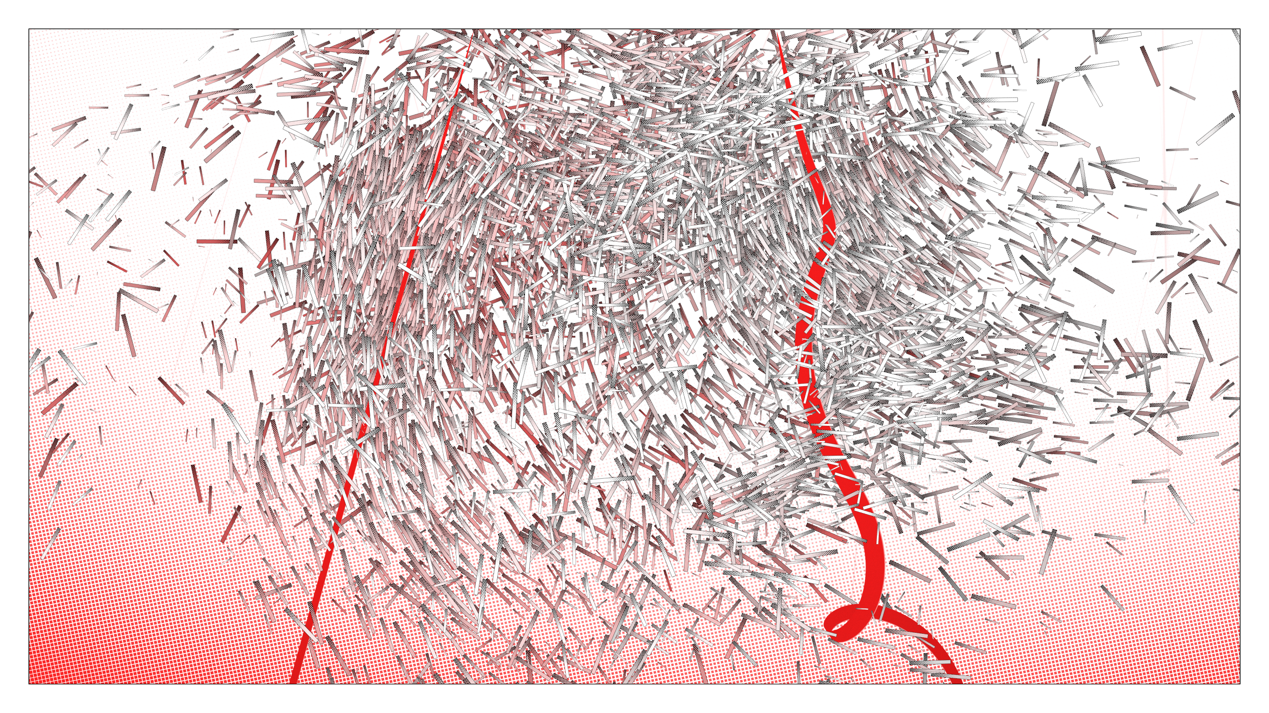
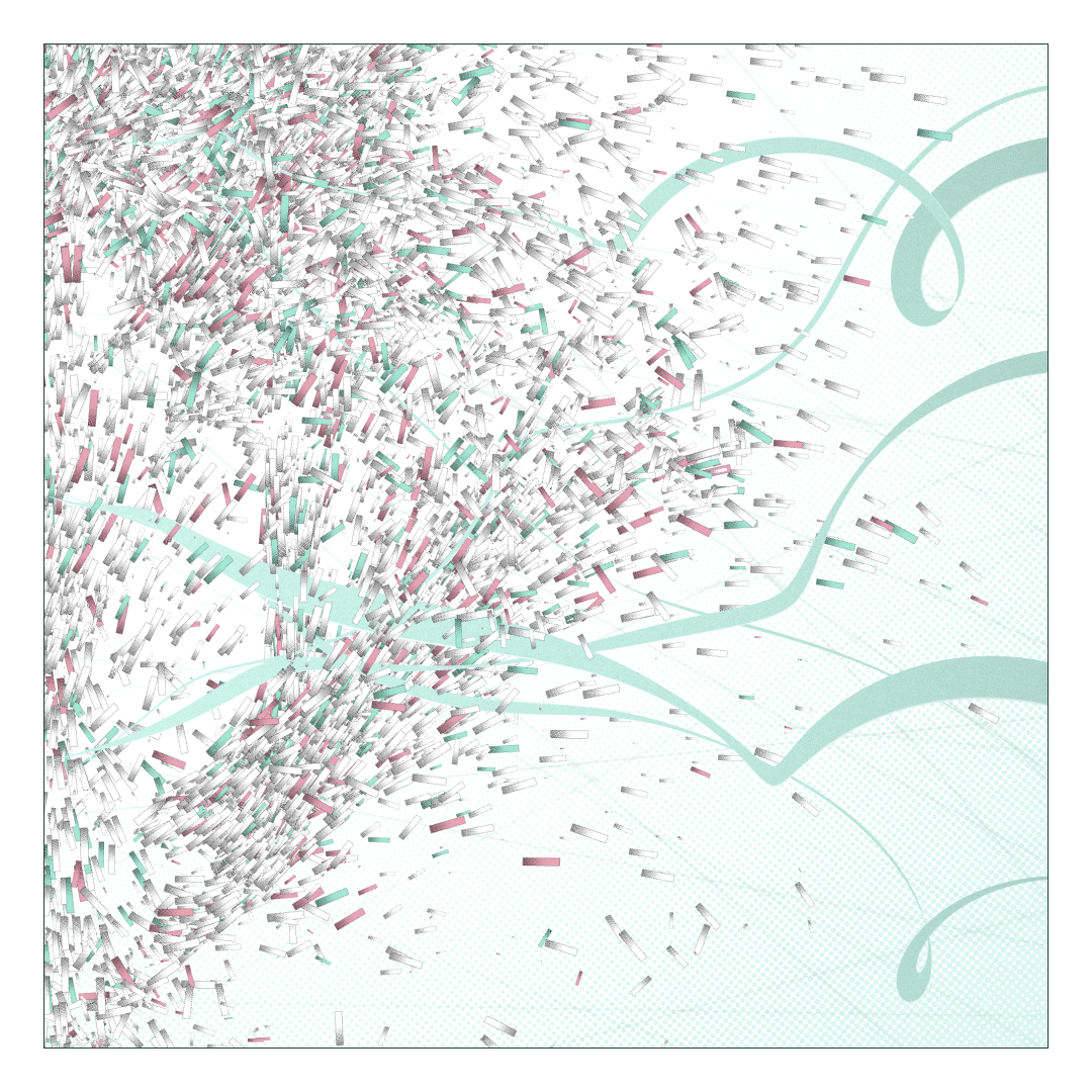
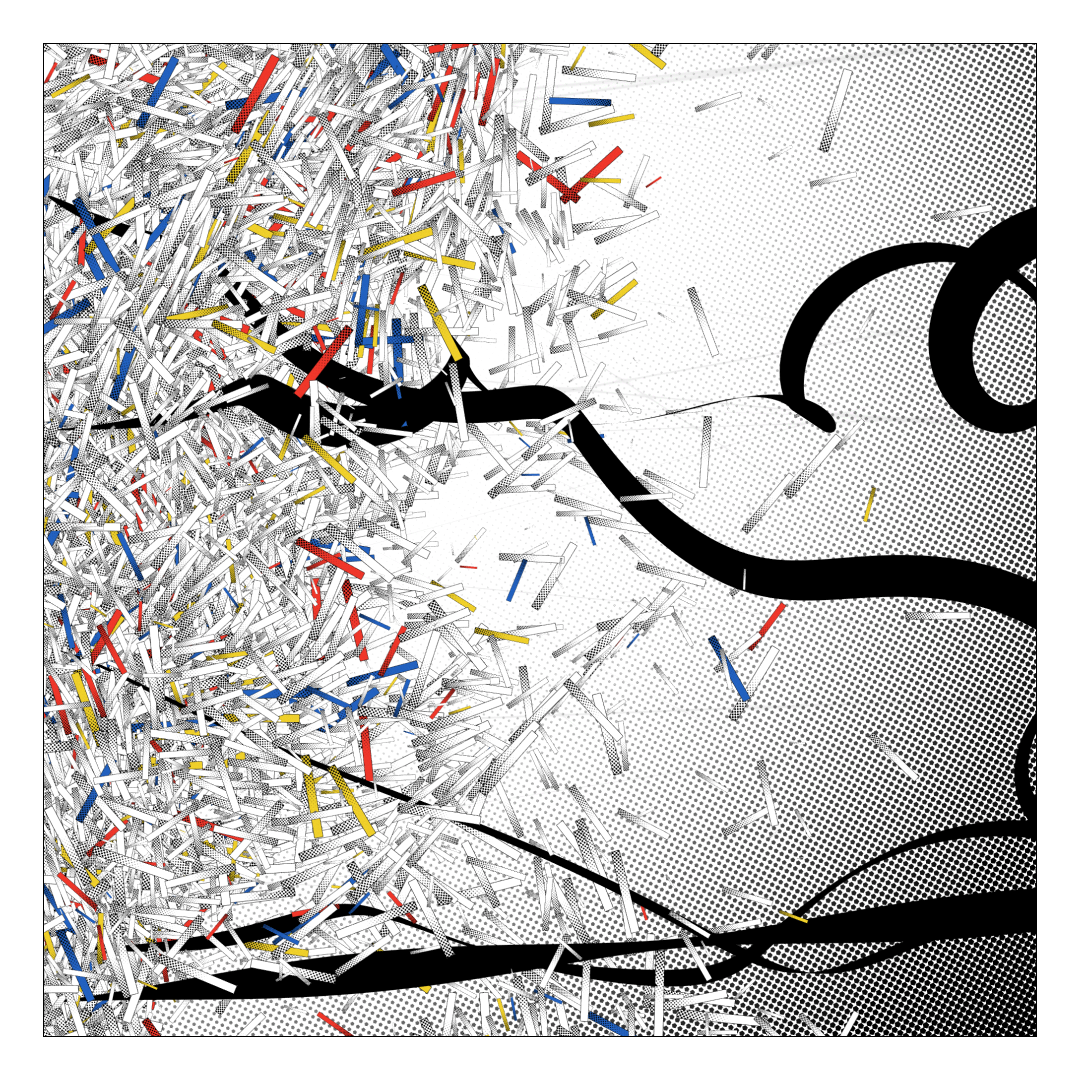
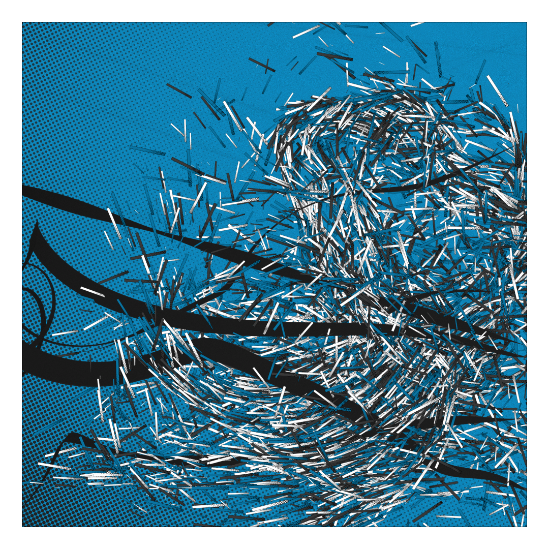
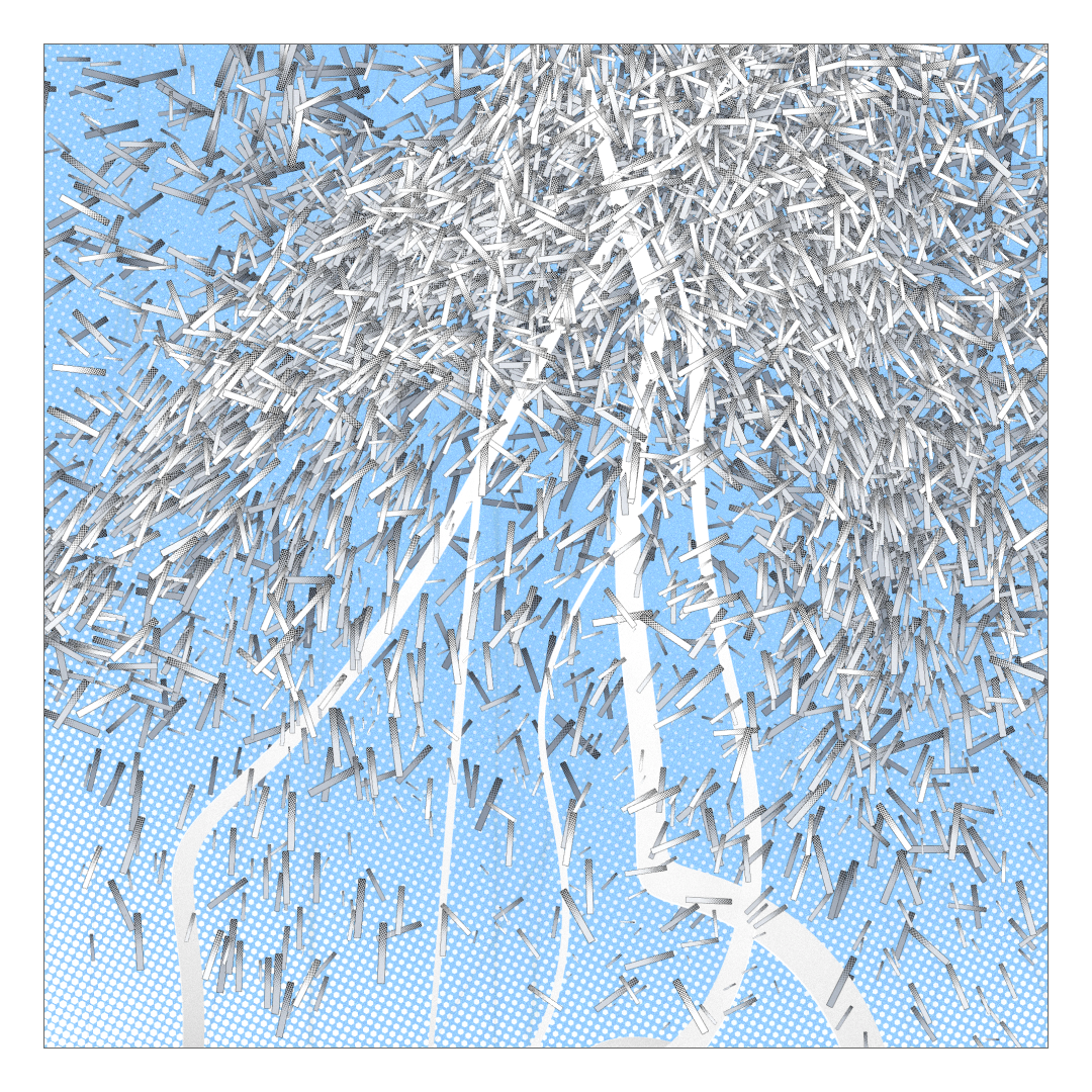
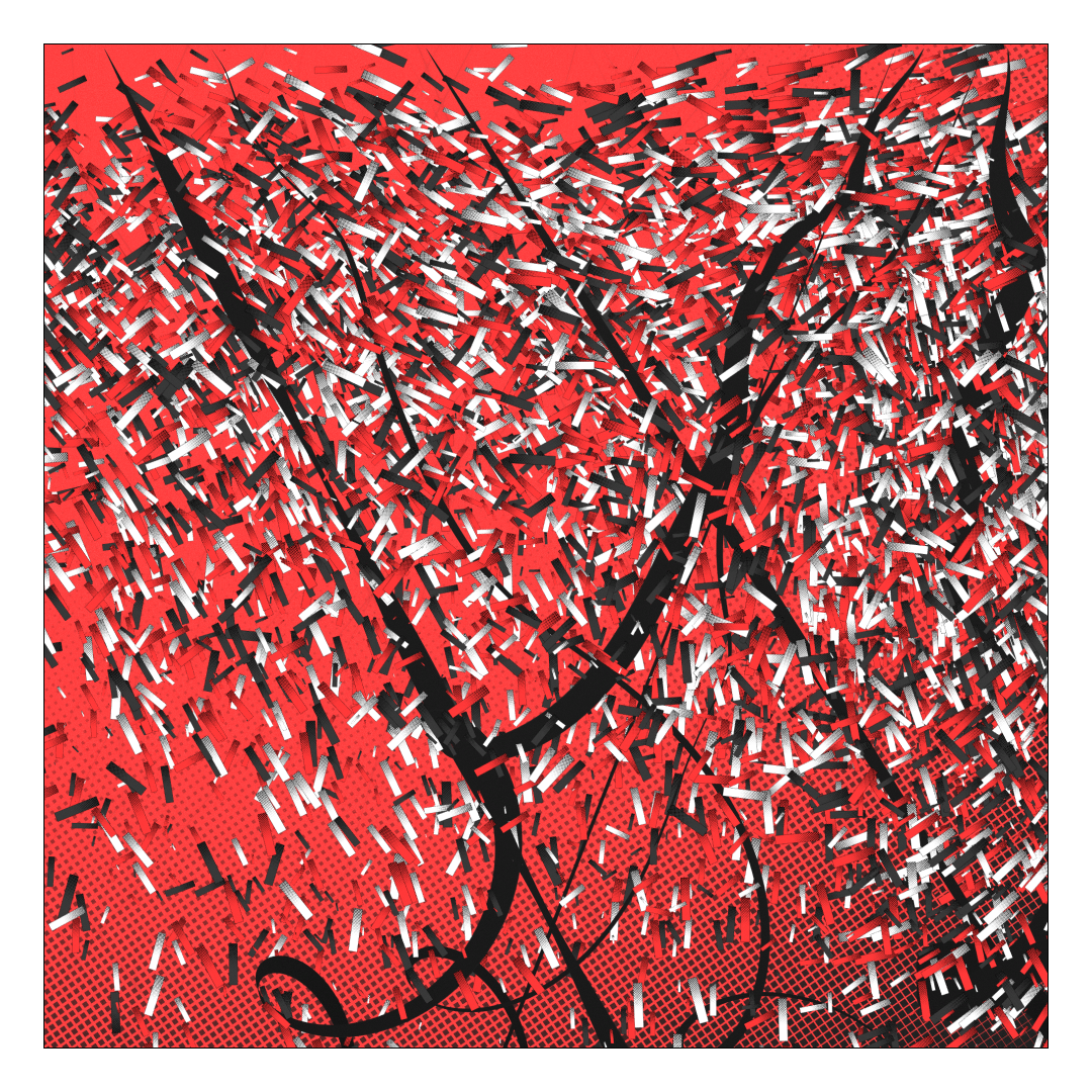
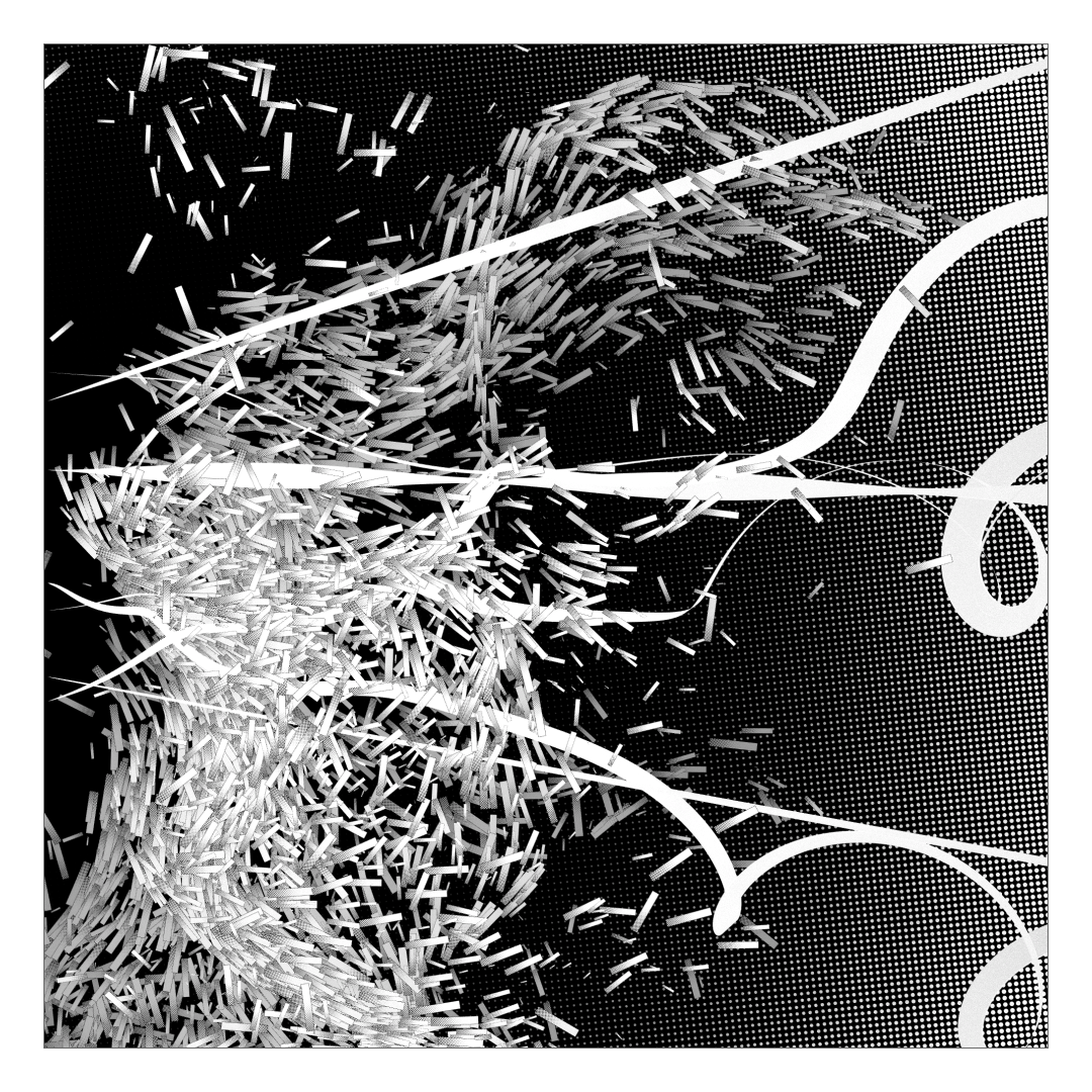
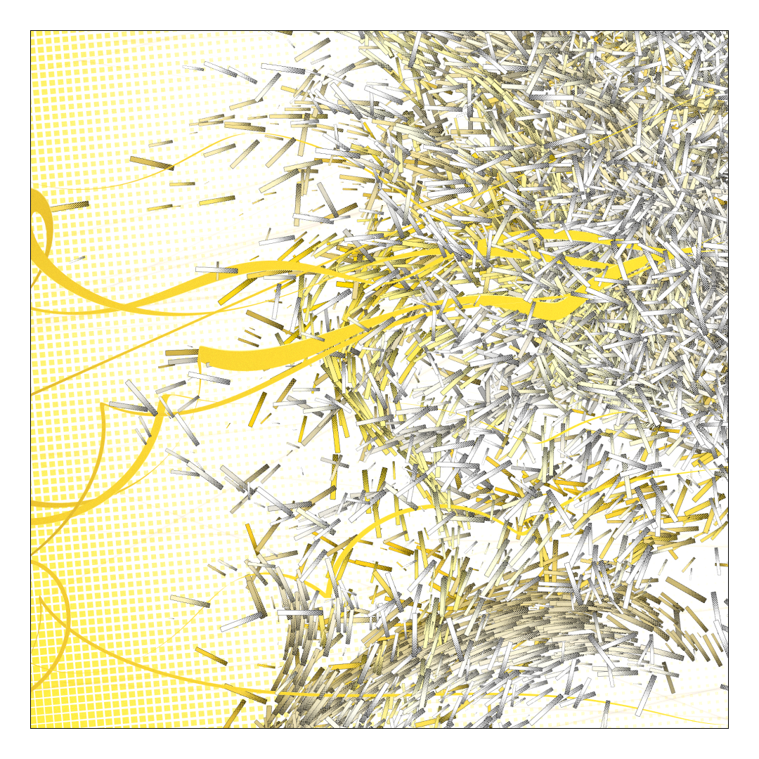
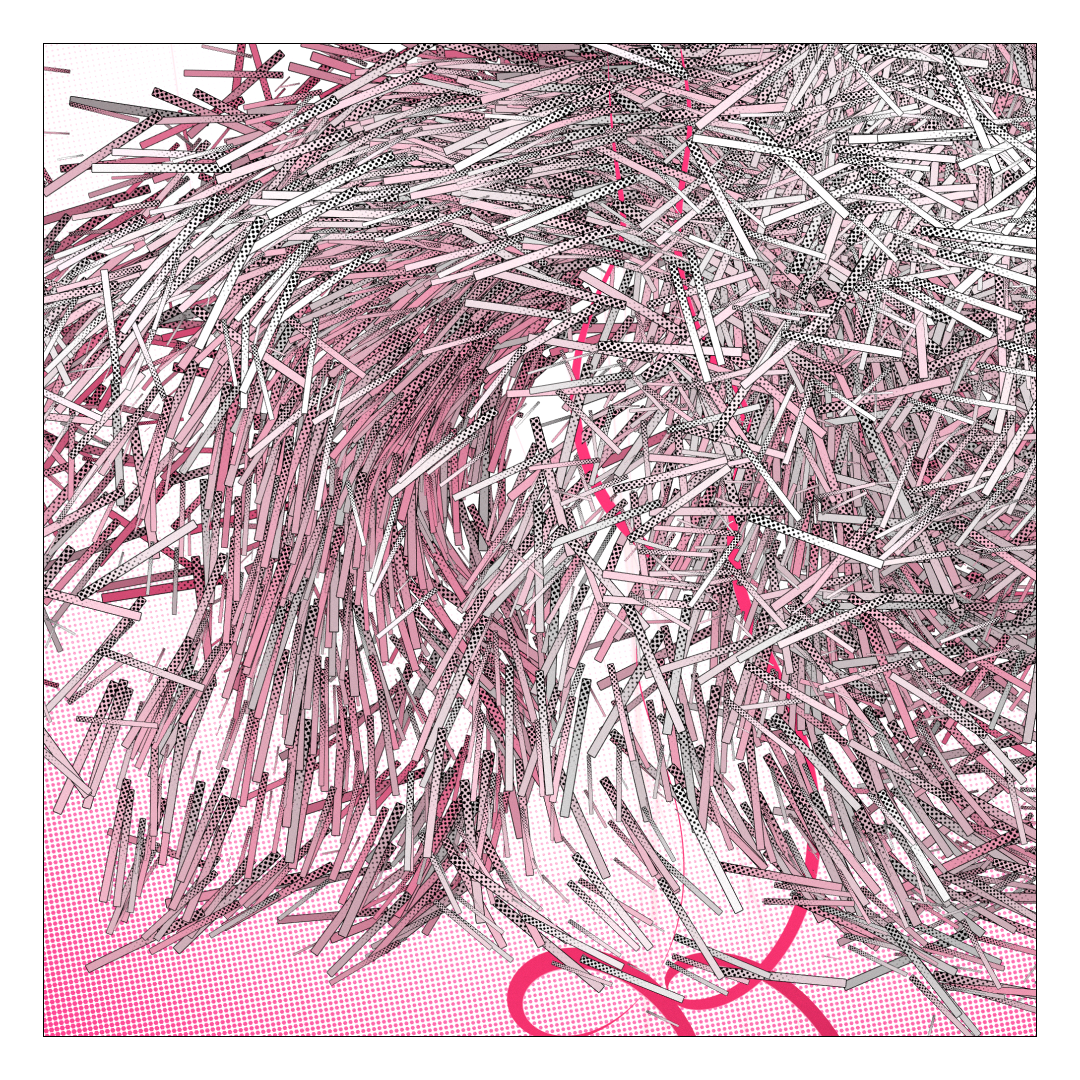
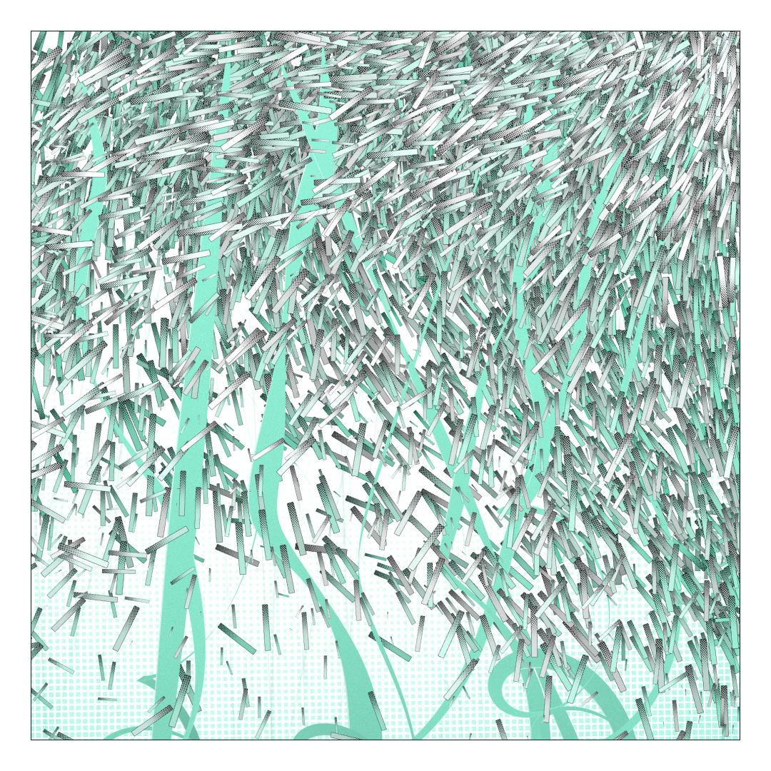
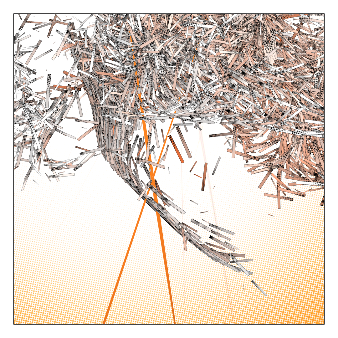
A high-energy take on the classic vector field vizualisations of extreme popularity since the Tyler Hobs article ( https://tylerxhobbs.com/essays/2020/flow-fields ) and Fidenza, in the form of a short but impactful animation that comes to rest in a highly detailed arrangement of lines, curves, rectangles and dots. A 2.5D and semi-physical approach to the genre, with a focus on realtime performances and clean high resolution captures, clad in a mix of pastel tones, saturated colors, and black lines, for a sort of Roy Lichtenstein / comic book feel.
Origin
After “It came from the stars” , I wanted to do something with a shorter scope and simpler concept. I had the itch to code the prototype for this for quite a few days, the basic idea being to mix a 3D vector field with some light physics, strike contrasting lines through it to play with the depth, and then animate the thing.
The prototype was already pretty satisfying to watch, and I like to add short animations to my projects to reinforce / clarify the intent ( see Neural collapse or Breakers ), so I animated the lines, and from that point on, I mostly pressed F5 while making sounds with my mouth.
I tested adding more elements to the background, but it always got too busy, so I shifted to the use of the various dots to bring more detail and texture, while keeping only the existing elements. I concentrated on the look of the high resolution outputs and testing what colours would match the pop feel i wanted.
I also realised partway through that some my output looked quite a bit like “Noise Unthreading” by Todemashi , which had to have had an impact on my reflections.
The feel is different but the base concept is very similar.
So thanks again Todemashi for the inspiration, and the encouraging words 🙂
General algorithm
Choose a palette which defines some colors and some rules about the use of colors.
Choose an aspect ratio and define some values regarding sizes accordingly

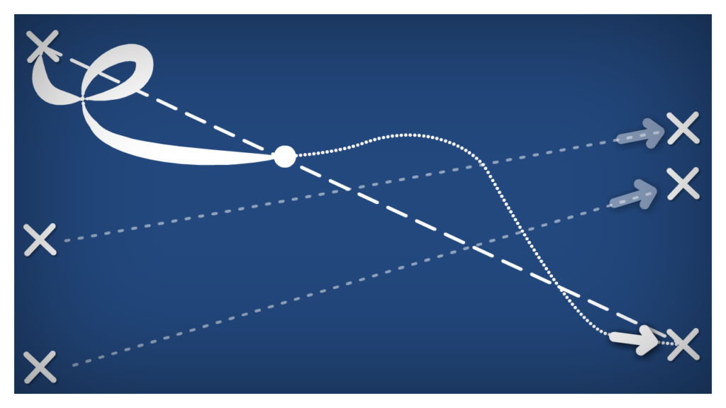
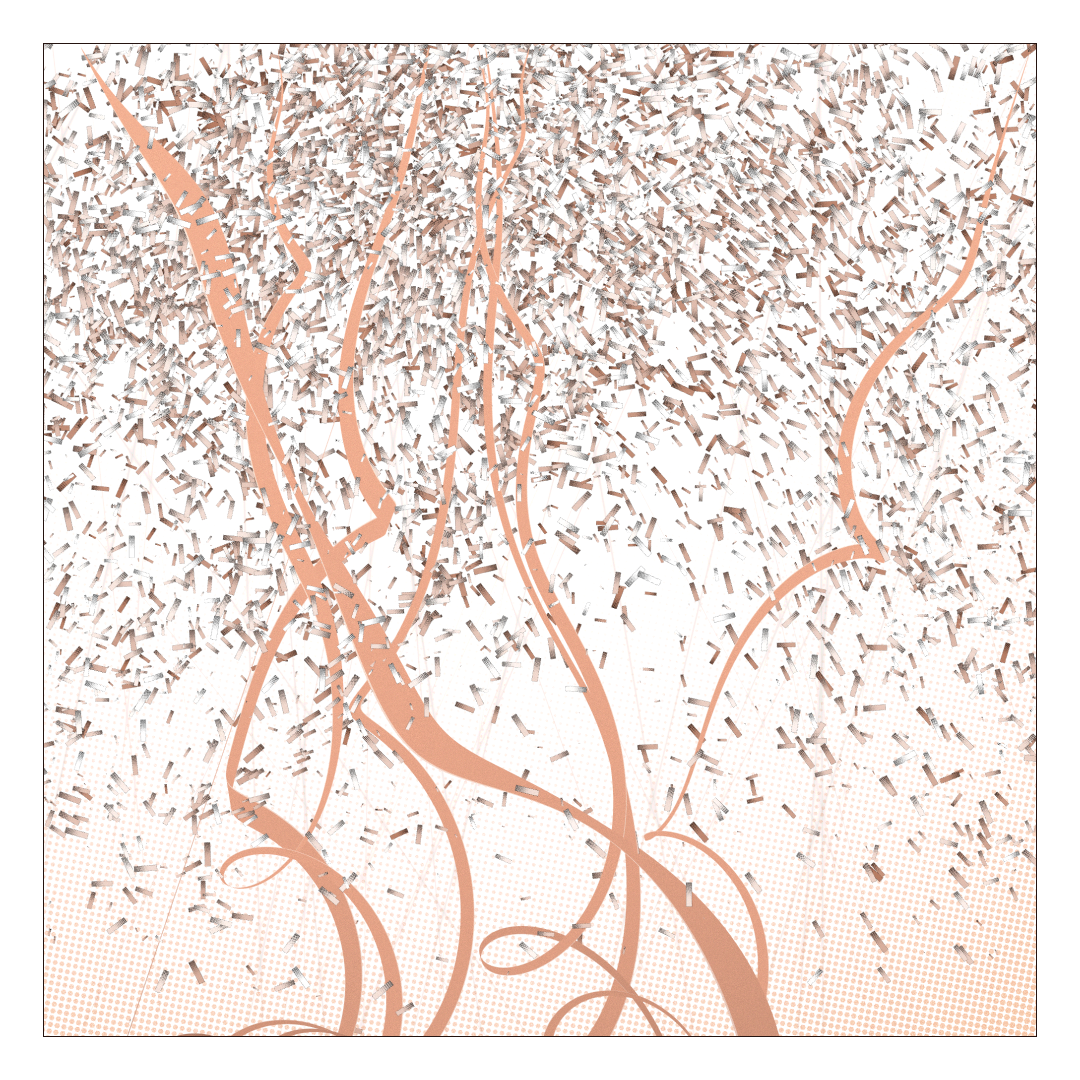
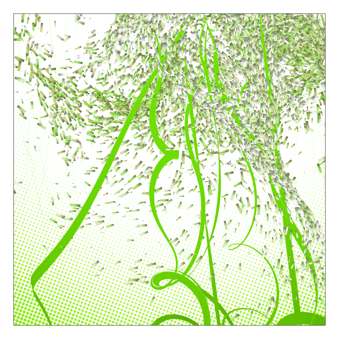
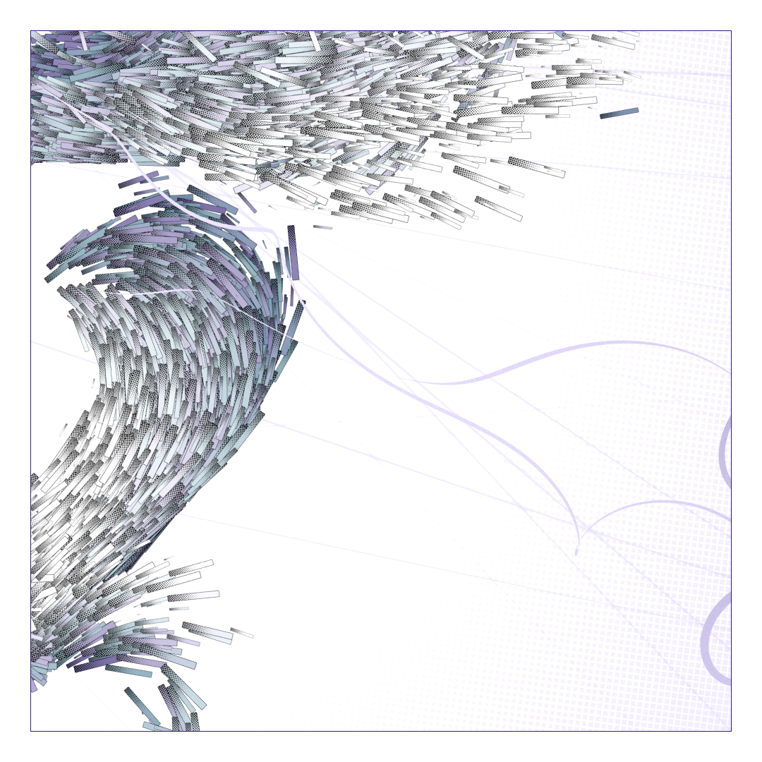
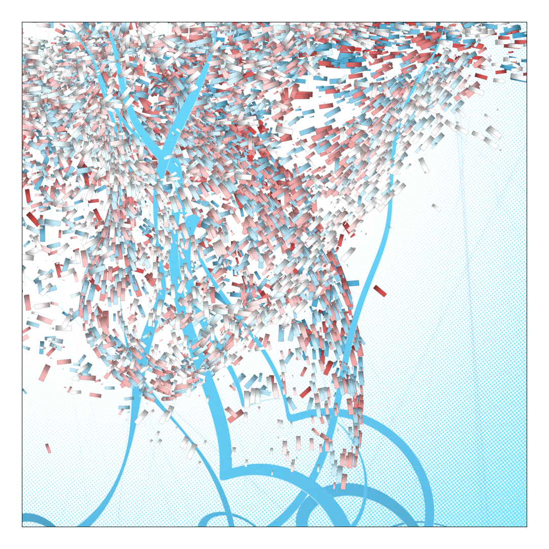
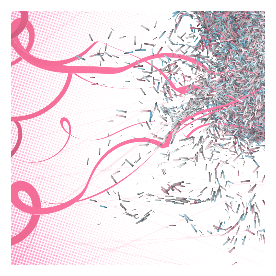
Pick a side (top, right, bottom, left). Along that side, define between one and ten points. That will be our explosions centers.

For each of these points, create a curve that starts somewhere along the opposite site and ends at the explosion. To define the curves, I used some sort of pendulum interpolated between the sides with various random speeds modifications. Save the tangent at the end of the curves for later.
Generate 8000 particles distributed equally among the explosions. Place them randomly in a sphere around their explosion center. Give them a random acceleration ( influenced by the previously saved tangent) , lifespan, delay, color, etc. for the animation.

Generate one or several 3d noises of random definition, depending on the “Shared noise” feature, true meaning that all explosions shared the same noise, false that they each have their own.
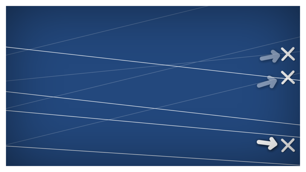
Generate also for each explosion between 5 and 10 “lines” that will appear during the animation and orient them roughly along the curve’s end tangent.
For the animation, each frame, move the particules according to their timings, life and acceleration, but also sample their noise at their position and magnetize their acceleration to a vector defined by the noise sample. In addition, display your curves according to the same timings, and also add some camera shake in the direction of the impacts and add the lines generated ealier.
Technical details
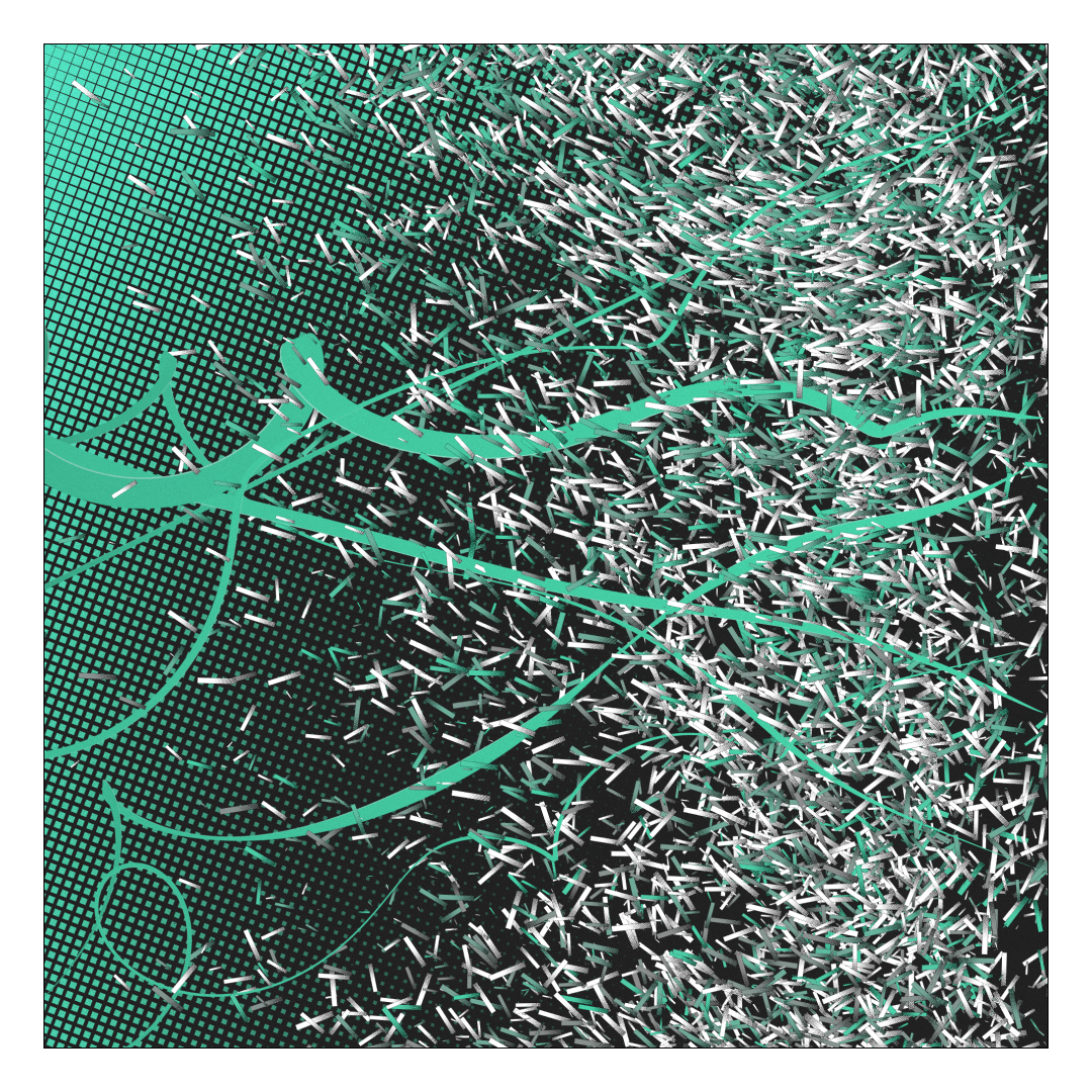
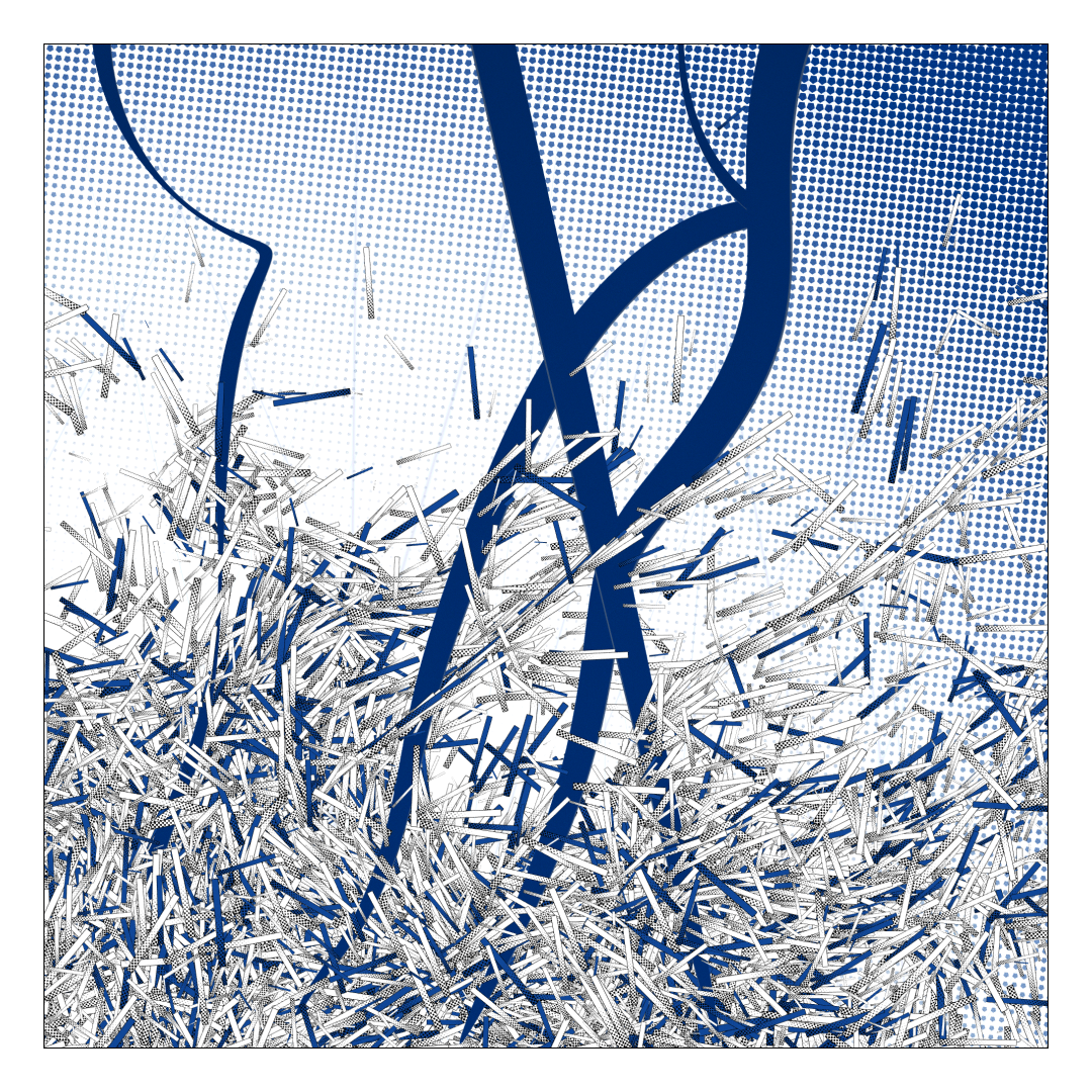
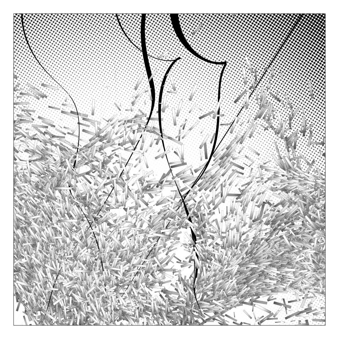
Everything is rendered in 3D, but really mostly for some light depth stuff. There’s no lighting, no shadows, no perspective. Only 4 elements compose the piece : the background, the curves, some lines and the particles.
Background
A simple quad placed in the back, the shader managing the pattern. It receives the coordinates of the first point of impact as well as the tangent’s angle to draw different patterns, chosen among squares, circles, pentagons and hexagons. Also handle its grain.

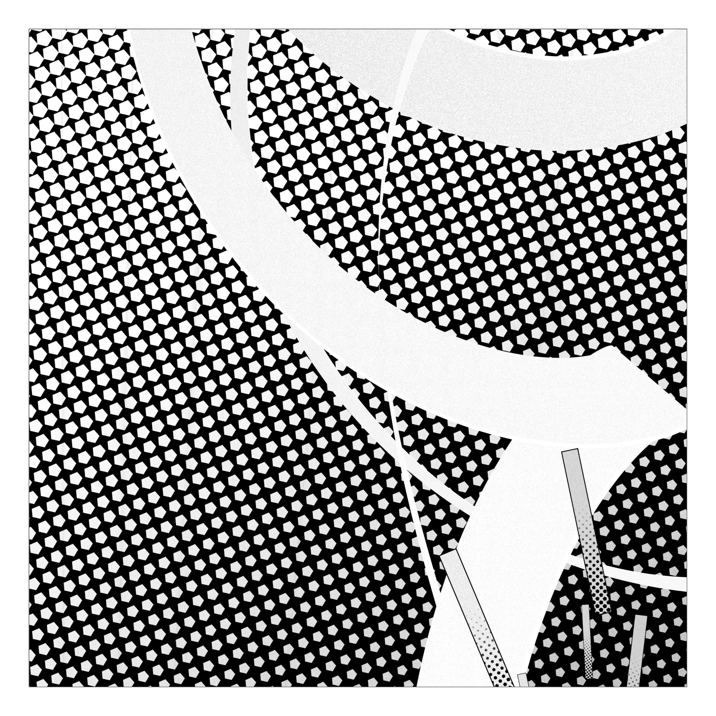

Curves
A repurposed triangle strip from “It came from the stars“, that draws along a predefined curve at various width. The width along the curve is chosen among 5 variants and the general width of the length is also randomized.
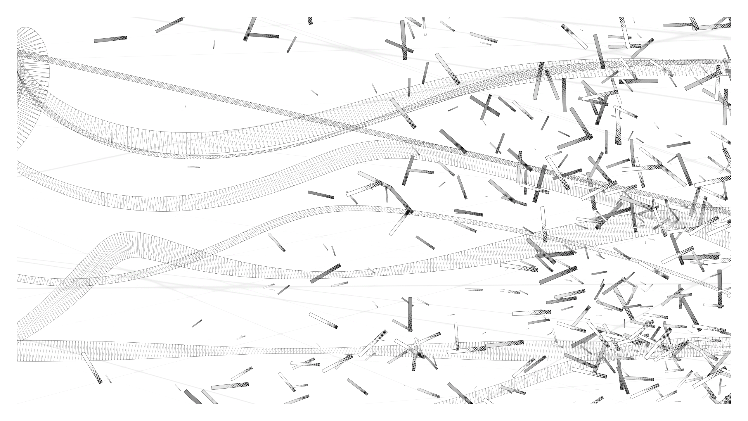
The curves start from the back and come linearily to the foreground towards the point of impact. This insures that it’ll interact nicely with the particles and add to the depth of the piece.
The shader handles some grain, plus a light thin border on one side and a slight gradient over the length.
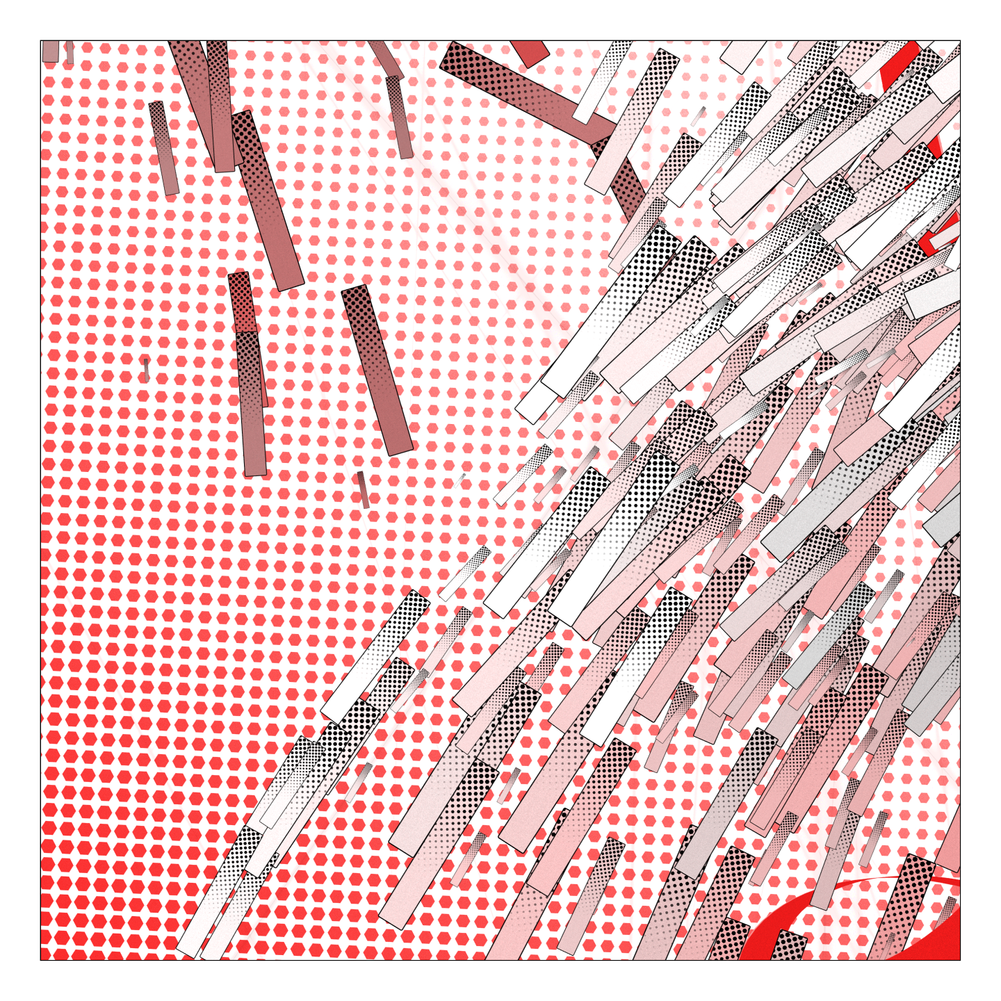
Particles
Each particle is drawn with a quad, and all quad share the same shader. They’re colored with vertex color data, and the shader handles the pattern ( same as the background, the rotation of the pattern depends on the first impact’s angle ) and the border which is slightly rounded, plus some grain.
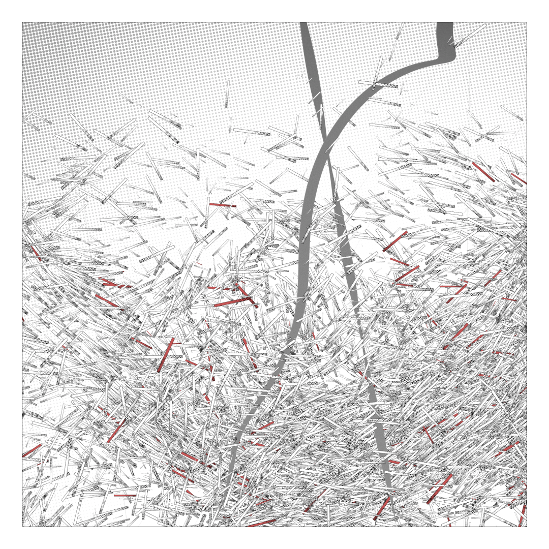
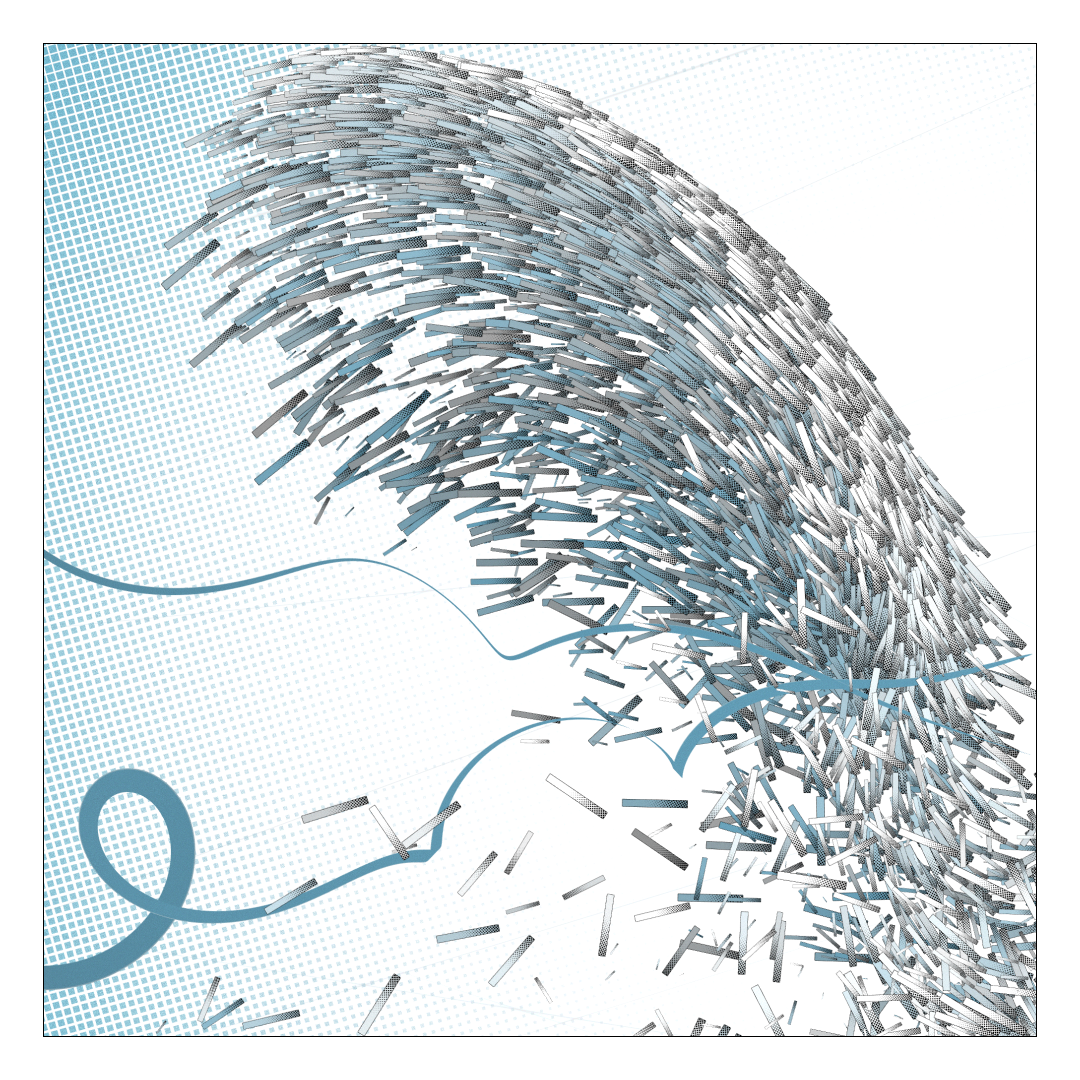
For the animation, the particles have their acceleration/velocity/position combo, with the acceleration being influenced by :
- A 3D simplex noise : the noise is sampled at the position of the particle, and the value is then used to calculate a shift in the acceleration. Only the x and y composants of the vector are used, z ( depth ) is handled more linearly according the acceleration set at creation. The “stickiness” of the noise is randomized.
- A “gravity” vector, wich depends on the side which is hit and the aspect ratio. Also has a random factor. This helps giving occasionally some more direction to the particles, but also propagate the particles more gracefully according to the apsect ratio.
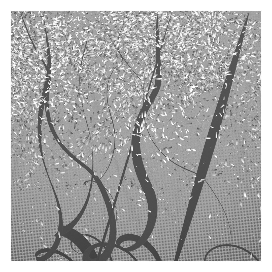
Same seed. Left : high stickiness, Right : low stickiness
Then they check collision with the borders of their space ( x and y only, z is free) and react accordingly. They also set a flag to reverse their reading from the noise after collisions.
Lines
Some very discrete lines appear with each explosion, in the background. Each is another single quad display a slightly blury line, and blendedd subtractivly. Between 5 and 9 are created for each explosion, and oriented in the same direction, with some randomization.
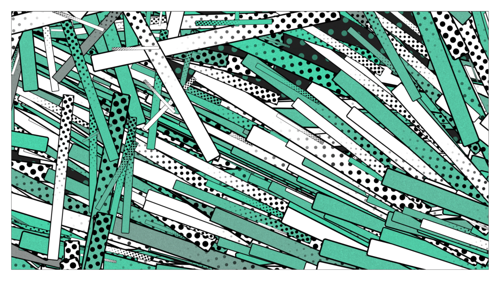
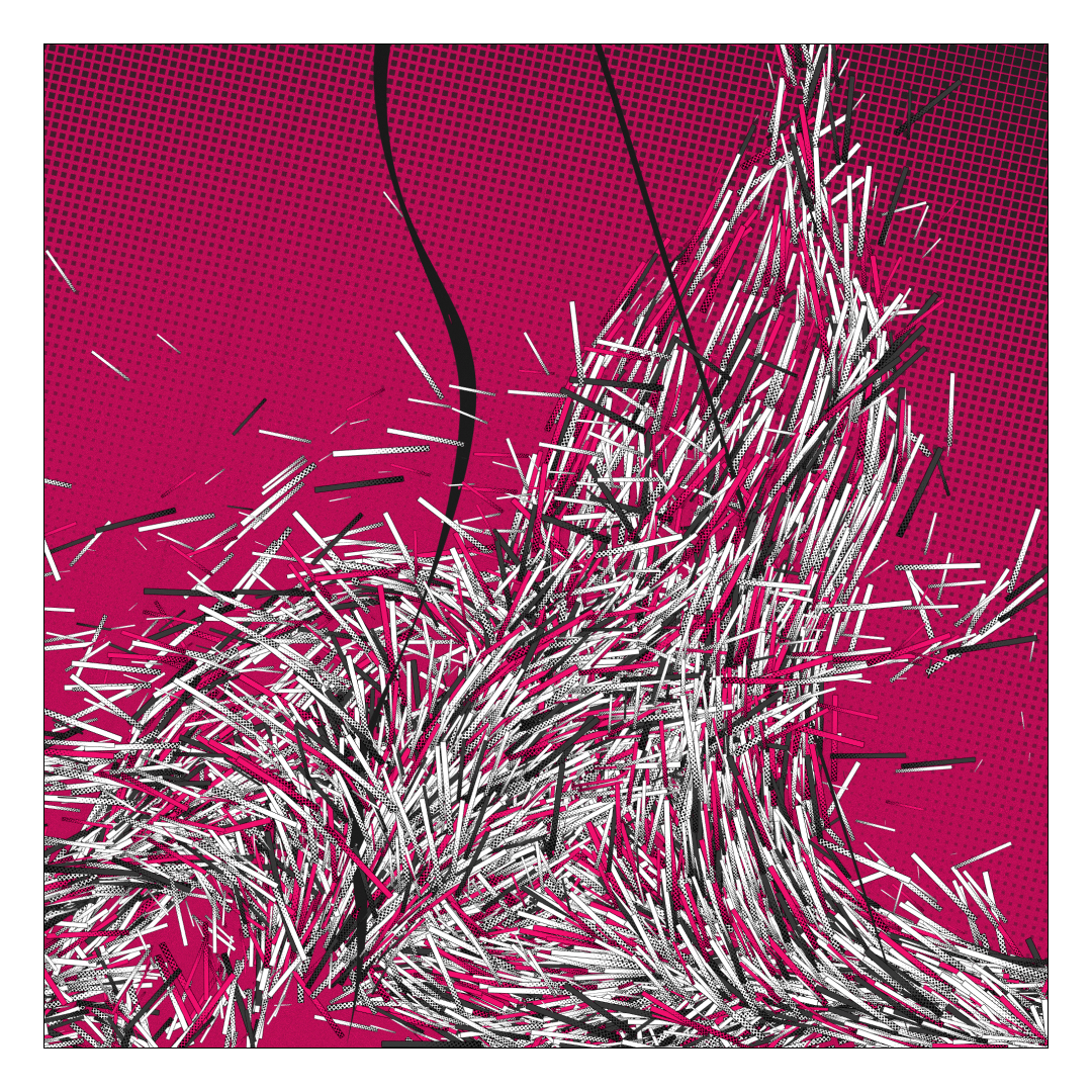
Palettes
I started with the contrast between a more saturated curves and desaturaterd particles at first, only using one main color, then later started very gradually adding some variations in what was allowed.
Ended up mostly with gentle and calm colors, I think to contrast with the violence of the animation. The piece is meant to be playful more than angry. Still, they’re is some more intense ones.

Thoughts
Always happy when I manage to respect my own time constraints and not go overboard. It was a breath of fresh air to mostly work in 2d, and I want to experiment more in that direction. Someday anyway, I have weird and maybe technically too challenging concept to test before that.
Really impatient to see what the mints will give, because even within the very strong base concept, there’s some interesting nuances of feel in the variations. I hope for a nice spread, from “party streamers” to “heavy bombardment”.